Ingress Insights: UI Pass 2
 NianticOfficial
Niantic › admin
Agents,
It’s time for UI Update 2! Our continued efforts to enhance Prime have been ongoing, and in 2.31.2, we focused on delivering a more advanced scanner and improved play experience for all. Agent feedback is invaluable, and plays a critical role in the decisions we make for the future of Prime. With UI Update 2, we continued to improve UI and UX interactions, and put in place key parity features. There are also some new additions agents should find effective in the field.
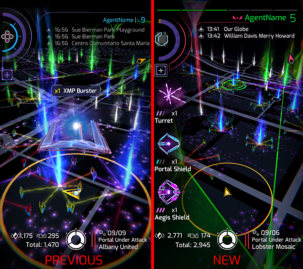
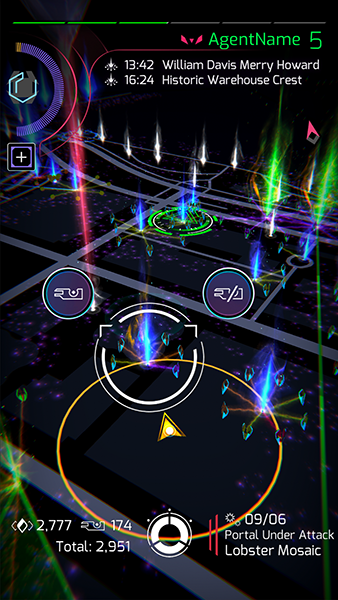
Starting on the map, we made adjustments to the hack output item animations and windows. Moving animations to the left side of the screen and windows above the action circle opens up important map real estate for continued play. Additionally, tapping a portal now opens the portal detail view directly, even if there are hack output windows open on the map.
A key parity feature that aids in on-the-move gameplay is long-press hacking on the map. Agents can now long-press a portal and swipe to hack with or without a key. No need to enter the portal detail view if you want to grab some gear on the go.
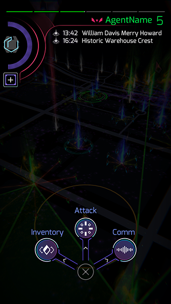
We have also added animations to better explain swipe actions one can make on the main menu button. A long-press on the main menu button expands to three primary buttons usually seen inside the main menu. This allows for quick swipe gestures without having to leave the map. Swipe up for the attack carousel, left for inventory, or right for comm.
Protip: The small dots on the main menu button indicate that long-press actions are available. On the portal detail view, agents can also long-press the swipe the Deploy, Hack, and Charge buttons.
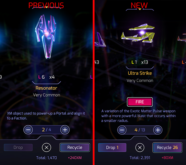
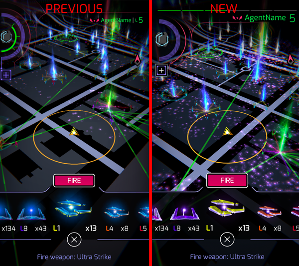
Moving on to the inventory carousel, it appears as though Ingress items may have been affected by dark matter or some as-yet undiscovered ordered data. The base color of inventory items or “XM objects” has shifted to mirror the XM hue, and item level and rarity colors should now be more visible for most items. This should help agents more easily identify items at a glance.
Additionally, we have added multi-item recycling and agents can now swipe to different categories within item detail view. This allows players to add specific quantities of items from each item category to their recycle total, helping to speed up inventory management.
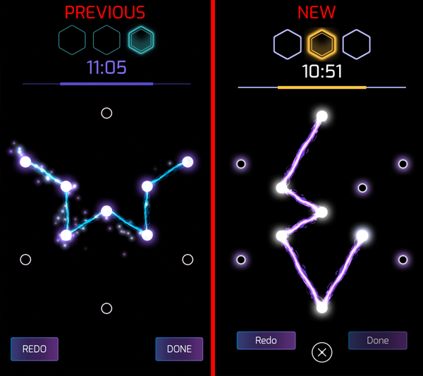
Accompanying the modifications above, glyph hacking has been refined to address readability issues, along with timing adjustments that really make this interaction snappy. The agent header has been updated to more accurately reflect progress on your current AP, which is now horizontally displayed at the top of your device. Mission UI has been polished for improved clarity, and list sorting has been fixed. The key icon within portal interaction now acts as a shortcut to key detail allowing faster key management. Finally, the implementation of tap feedback adds a crucial layer of response when interacting with the scanner.
We hope these new additions to the Prime scanner will serve you well.
- The Ingress Team
Comments
Love that the items pop up on the side of the screen now! Also quick key preference!
Nice. As a long time agent (6ish years I think) I've finally shifted to Prime this month, and it's been hard work. But changes like this are good. Can Update 3 be bigger portal icons when fully zoomed out? I cycle a lot with my phone in a holder and it feels like I need 20 screen taps to actually select a uncapped/low level portal as the tap needs to be pixel perfect, Not always easy when on the move.
@NianticOfficial so redacted will retire and prime still doesn't support Arabic and other right to left languages?
I'd like my glyphs now please lol
The, nearest portals, thing is still blocking the player from seeing what is around them
Fields are too high in transparency/low opacity, which gives the illusion of being able to link when you cannot, because you cannot see the field. Particularly in bright sunlight.
The animation of hacked items unnecessarily reduces visibility of the game map.
The list of hacked items is in the way of seeing the game map. And unfortunately, with the new UI, it will always be in the way! It really just needs to go, and have a player journal which details what they got, if they want to know what they got.
The new hues of XM devices make it difficult to discern from colour alone if they are a L2 or L3 resonator.
L6 or L7 resonator, etc. Same with XMPs
Swipe to hack a portal will definitely help those who have not transitioned to Prime.
The XM on the ground is back to not being visible.
It was fixed, now it is unfixed.
You forgot to mention the new Contribute to this Portal Menu. Very important add 😄
Did you just leak New Glyphs?
No.
Nope. It's just half-Armony.
The XM on the ground is back to not being visible.
Wat?
Additionally, we have added multi-item recycling
To be clear, this is 'multi-item-type' recycling. As in being able to select parts of multiple types of item for recycling.
2951 items?
Developer build or sneak peek for the masses?
I could get on an increased inventory bandwagon.
A few things that need fixing as of the current version on iPhone:
The recycle button after management may sometimes not be visible, but pressing at the location will reveal the button.
Charge and Manage buttons should switch sides.
When rapid-linking, sometimes the game won’t register certain links, forcing you to back out and attempt to link again.
2945 items and still glyph hacking and not in the red. Are we getting a bump to 3000 items soon?
Nice improvements. You have my thumbs up on the gestures access menu. Now if we can work on the portal key carousel itself whereby portal key actions can be accessed easily without downloading excess data on viewing photos, that would make things more snappy.
Thats really cool @NianticOfficial :-)
Now it's time to color the blue burster either in a neutral color, like Redacted, or better yet, to color the blue burster for the RES and green for the ENL. It is very unpleasant and irritating for many ENL that the UI is designed rather blue. But it's nice that many things are still being changed according to the wishes of the community.
Where is the feature parity item to be able to see ENL fields on the screen? I cannot tell when a field is green unless my brightness is up to eye searing levels. @RedSoloCup @NianticBrian @NianticAkshay @NianticAustin @NianticBC @NianticCasey
This blog post would have been awesome the day the update came out or even before. When will we get some #ingressinsights into new stuff that's coming, now that you've essentially reached parity?
After every update I check if I can see the XM on the ground. Still nothing.... i.e. useless for me compared to REDACTED. (iPhone SE, v2.31.2)
I really hope that prime will look like these pictures once REDACTED is shut down.
What I still miss is the ability to see if a portal is shielded and when a shield gets destroyed without switching from attack mode to the portal view.
This is the current version. So, you're NOT going to be updating this before Redacted goes? Or this IS the last version prior to Redacted & the next update will come when Redacted is cremated? #confused
(on v.2.31.2)
Changes from UI1 to UI2:
@agentname has recursed and faction changed
Max item capacity changed from 2000 to 3000
I can tell Enl fields are there with 2+ layers, with one, I agree, it's not quite there. A more grey base map MIGHT help with that.
It's super easy to see even a single field in Redacted. The exact same location and field is very hard to see in Prime. :(
Starting on the map, we made adjustments to the hack output item animations and windows. Moving animations to the left side of the screen and windows above the action circle opens up important map real estate for continued play. Additionally, tapping a portal now opens the portal detail view directly, even if there are hack output windows open on the map.
Only to be then take up by the useless "Nearby" feature which does nothing but get in the way. Good job, you actually made things worse.
A key parity feature that aids in on-the-move gameplay is long-press hacking on the map. Agents can now long-press a portal and swipe to hack with or without a key. No need to enter the portal detail view if you want to grab some gear on the go.
Kinda pointless IMO because it was just as easy and quick to hit the portal and hit the hack button if you were simply doing quick hacks.
Accompanying the modifications above, glyph hacking has been refined to address readability issues, along with timing adjustments that really make this interaction snappy.
Can we have the 3-2-1 countdown back? It made it a lot easier to know when to start hacking and it gave me time to do a quick check of my surroundings before it was time to enter the glyphs.
Finally, clearer item differentiation like it should have been in the first place.
So, the blurry visual still on?!
Still Terrible.
Love the 321 glyph countdown is gone, so much quicker and less frustration. The colours and graphics as so much better with the glyph hacking too.
The new colours for item level looks great.
Reading the above feedback I disagree with a lot of comments and if you took them all on board it would create issues where I think you have made improvements. I have some suggestions based on some of the feedback above.
I agree that I don't want to see the summary of hacked items on the screen. A hack journal found in the comms menu would be better.
I suggest adding the following:
- field opacity slider.
- portal size slider.
- xm opacity slider
- nearby portal on/off option
Bonus Suggestion:
- AR camera to take photos of portals in the real world. Could maybe even animate attacks while in AR.
Is battery life improved?
The promised feature parity is still lacking the "Navigate to Portal" option. Instead a totally pointless and annoying option to show nearbyportals has been introduced.
5 days to go for feature parity or a lot of agents will frustratedly quit Ingress.
P.S. IMHO it's to avoid getting eye disfunctions caused by this potter-ish bling-bling UI.
The two things I would love a settings switch for is all the UI details to stay when fully zoomed out. Or allow me a slider to adjust the max camera range. Option to turn off the image inside of the smoke on the portal. And or a slider to adjust the size of the smoke. Reasons why I find the at times when zoomed in to see the roads on the map the smoke will full up the screen.
Thank you for finally removing that horrid glow from items, finally I will be able to tell item levels apart.