Poor design choices for Hexathlon results sheet
There were two ways to see Hexathlon results in progress:
1. Go from the scanner to the Niantic events page to your local event and tap on "Progress" to see a nicely formatted page with your personal progress including Elite status. Nice, useful, and not advertised in any official Niantic communications that I saw. Got a 404 if you tried to view it directly without following the cookie crumbs from your scanner.
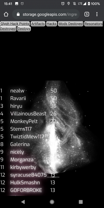
2. Follow the link advertised in the media drop and official email to get the following page:
Two things stand out in this screen capture:
1. Whoever laid out this page didn't stop to think that maybe, just maybe, important white text becomes illegible when viewed against the white portion of a background image.
2. Whoever laid out this page didn't stop to think that maybe, just maybe, it might be nice in Hexathlon conditions with heavily overloaded mobile networks, and intense device use to have a fast cleanly loading page without superfluous graphical elements taking up network bandwidth and device processing capability. Several times I went to this page and the background jerked and stammered and tiled awkwardly a few times before settling down, even though I took the precaution of closing all browser tabs except Hexathlon results and all apps except scanner and Chrome.
The Hexathlon was fun and cool and Ingress mostly worked. But the realtime presentation of results, while accurate and useful, was significantly marred by Niantic design choices and communication lapses.
Device: Pixel 2XL with current Android. 100% screen brightness, as that's what it takes to make Ingress playable in bright sunlight.
Network: AT&T unthrottled.
Browser: current Chrome

Comments
Note:.
The word asterisked out by the overly aggressive obscenity filter was
S
H
O
T
As used to describe the process of capturing an image from the screen.
This could be shown inside the game in a other tab of scoreboards menu.
Last field test event was over 5? months ago and people commented back then that the page was clunky to use...Alas on deaf ears😟
How much development effort does it take to replace that background image with something more neutral or just outright comment it out... Nobody internally in all of Niantic realized that white text on white background is kinda hard to read? 🤷♂️
Yeah, that looks so bad wow....
The score sheet does look a lot better on my laptop, but I don't think anyone was carrying a laptop at the Hexathlon:
But, you know, designing a web page to be legible in different screen sizes isn't rocket science; you'd think that "legible on a mobile device" would be one of the design criteria for something like this. Even just marking Elite scores with a star instead of (or in addition to) a slightly-different color fuzzy halo that showed up on some (but not all) devices/browsers would have been a huge legibility help.
Summary: Niantic, please stop prioritizing "cool" over "functional" in your graphic design choices. Cool and functional is fine. Cool and not functional is not.
(This is the screen capture that apparently got filtered out of the post above because the standard file name for a Mac screen capture includes a forbidden word.)