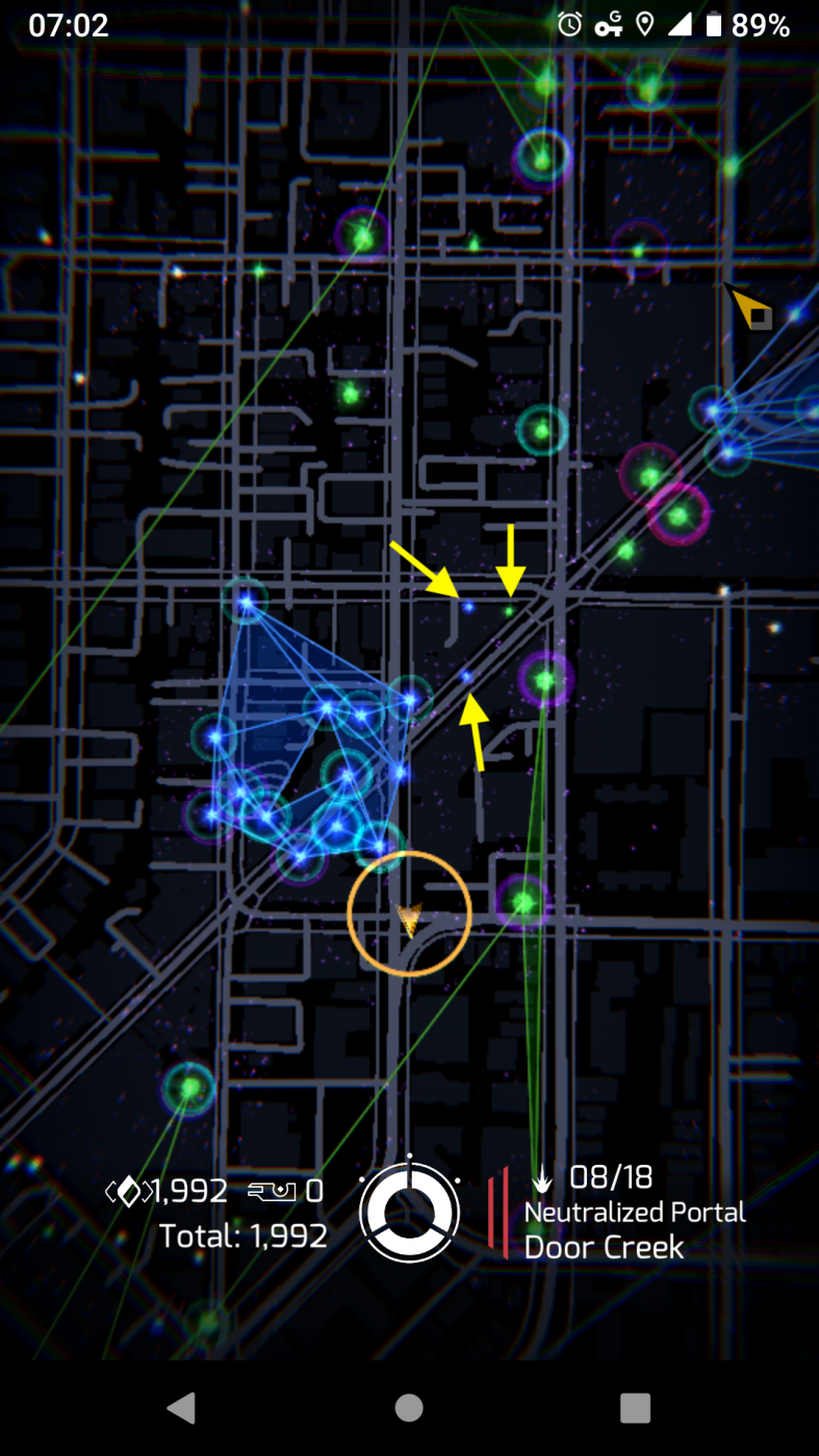
Thoughts on the main map view in v2.29.2
In over four years of playing on [REDACTED], I didn't notice that higher-level portals are larger than lower-level portals until someone pointed out the difference to me. Part of me still thinks it's just a placebo effect, that there is no actual difference.
So, it was rather delightful launching v2.29.2 and taking in the new landscape. For the first time since I started using Prime, I looked out on a grouping for blue, linked and fielded portals and thought, "this is a beautiful sea of blue." The portals actually looked like portals, with their well-defined "cores" or "flames" or whatever you want to call them. Different level portals obviously had different sizes.
I've played on this new version for a few days, now, both indoors and outdoors. The change to how portals are rendered is a definite improvement, especially out in the sun. I no longer feel like I'm constantly struggling to see the portals around me.
If I might make a suggestion: Make the current L2/L3 portal size the smallest. Unclaimed and L1 portals are still a touch too small for my eyes, especially in the top-down view, where they still have the feel of being a single pixel on the screen.
