Ingress Insights: UI Pass 1
 NianticOfficial
Niantic › admin
Agents,
As we move into the second half of 2019, we’d like to share some updates that we’ve made to the Ingress Prime Scanner. We have been hard at work calibrating our technology in order to bring you an improved Agent experience.
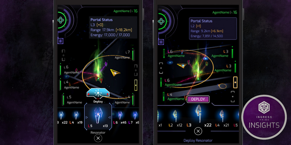
Our goal with UI Update 1 is to bring more clarity to interactions throughout Prime. We are enhancing the readability and consistency of visuals while addressing Agent feedback. These changes should help Agents navigate the interface with more confidence and ease.
For example, we have included information text below our carousels to provide more context on what actions users should take in relation to the screen that they are in. New and experienced Agents alike should benefit from these instructions.
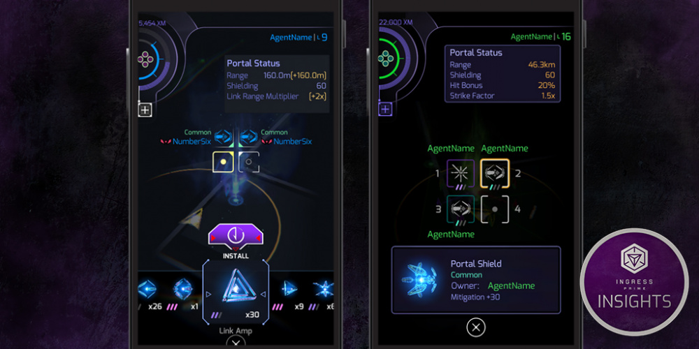
Another area we have improved are the Portal modification rarity indicators (commonly referred to as MODs) in Portal Interaction. Using the consistent three-stripe-rarity indicator, along with adding rarity color in the deployed border, should help Agents identify these at a glance. This change was also implemented to address an accessibility issue for those with color vision deficiency. We continue to strive for inclusivity and want all of our Agents to have an enjoyable play experience.
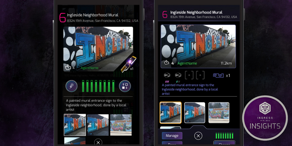
Within MOD detail, the enlarged layout makes for an effortless interaction and the slot numbers aid in better communicating deployment plans with fellow Agents. The Scanner has also been upgraded to display MODs within Key Detail to give players more information on the portals they are inspecting.
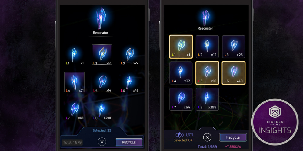
An exciting parity feature we have included in this update is XM prediction. When managing your inventory, it now displays the calculated XM return you will gain from recycling. This value will change in color to signal if your prediction will exceed your XM tank capacity.
There are many other upgrades you will notice throughout Prime such as enhanced selection states, faster UX, and improved daytime readability. We hope these new additions encourage you to get out and explore the world around you! Stay tuned for more to come as we work to provide exciting updates to the Ingress experience. We will continue to review your feedback as we make more improvements.
- The Ingress Team
Comments
Looking good so far! I'm excited to use the new UI. I hope readability in sunlight is improved, and it seems like the new colors are a start.
Yes! The redesigned Mods interface and multi-selection is so very needed.
"An exciting parity feature we have included"... Really? Maybe you should rephrase it to "Sorry for taking us this long to introduce something that should have been there from the beginning.
Sounds great, but what about "the flash"? A lot of agents, including myself, find that VERY annoying.
Where's the support for Android Q though
These interfaces, and buttons, are going to be too small.
I don't have big digits, but even I will have difficulty tapping them.
The installed mods, needs to scale up to use the entire width of the mobile display
The extra portal Photos need to be in a separate tab.
Is it only me, but i still find the energybar of resonater too small? I'll try to use prime more to get used to it.
So the agent name "AgentName" is already taken!?!
It's a start guys. We need to use it more to get used to it.
I'm really glad they're addressing readability, which has been quite frustrating.
The big, big problem is still the at-a-glance information about portals and fields on the main screen, though. The bright colors and clear positions of portals in the original scanner, the "thready" fields at weak anchors, etc., make a huge difference in playability.
Also, it looks like it'll still be just as hard to select a portal slot when deploying. That was a really weird change, to go from easily-selectable hexes to slender little lines; I can only imagine it was to make more room to show off the silly flame effects.
Anyway, keep at it, Niantic, and maybe the upgraded scanner will, eventually, be as good as the one it replaced!
Mods are blue, resonators too like maked from blue glass or plastic.
Make green ui, and items style for the enlightment and blue for the resistance! Please.
Keep at it, that's a good way. Fields could be better visible. And many more things - resonator slots could be much bigger etc.
I miss filling up capsule at one click, as it was in redacted.
Please ditch the hack output box, and put that info into the activities list under comm.
The current hack output steals focus, requiring a second tap to do anything else. Moving it to the activities tab would make life just easier. Leave the item popup animations from the portal.
Resonators above the button to deploy them...
bursters above the button used to fire them...
Resos grouped together in the portal screen...
Remove the flash of the sonar effect...
Make going In and out of menu item screens the same number of actions...
These would make it more playable.
learn how to make a decent UI... please.
Please make fields like in old Ingress, when portal is almost dead.
Here is difference in old and new app: ibb.co/BNxV66W
Yes - and there will be an additional update coming in 2.28 to help this as well.
Hang tight for 2.28 where we will offer some ability to adjust for lighting.
Android Q should be supported as of 2.27 (and we understand was functional before, as well, though some reports were made to the contrary but weren't verified.)
Dont display all the photos of a portal, is a waste of resources, bandwidth, battery and mobile processor time.
I look forward to the recycling enhancements but it looks like the reso recycling will have the same shortcomings as key recycling, namely if you don't want to recycle all of one key type you can't use the multi select feature.
I'm loving the progress. Can't wait to try the UI update.
Look forward to trying out new UI.
Can you have the key carousel scroll left/right rather than up/down. Every other carousel, including loading/unloading keys into capaules, is left right.
The flash and moving fields are unnecessary.
I undertsan that rarity of the hack output will viewable when the item goes out of the portal. Am I right?
The characteristic that bothers me the most about Prime scanner is the blurry visual of the map, the UI is getting better and better, but the visual of the map on Redacted is so much more defined and pleasant.
I'm really looking forward to that UI update :-). It looks pretty good at those images above.
Still no resonator facing indicator when deploying? The old UI indicating north reso made coordinating much easier, it seems like this would be an easy feature to port over.
The main gripe I have is that the colour scheme on Prime is just too DARK. The lack of contrast makes it hard to easily distinguish elements on the screen. While I can live with the re-arrangment of actions, the playability is severely reduced when I keep missing details on the main screen.
This is going for a good path, fix the issue where an area has too many portals under attack and Prime keeps stuck loading the portal key.
Thank you for listening to feedback about the display. For a lot of us, it's just been too difficult to see what was happening -- this looks like a real improvement in visibility. And thank you for the xm recycling warning! This alone will get me to use Prime more often.