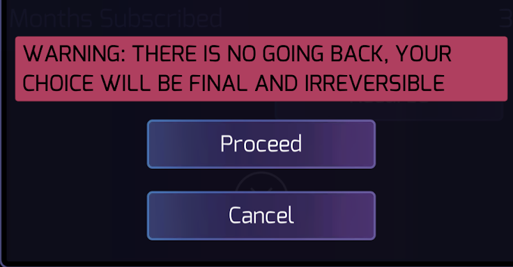
Recursion workflow is misleading
When you go through the recursion process you get to a screen that says that this is final and there is no going back, and that your choice will be final and irreversible. The very next screen is a four-hour cooldown that gives you the option to cancel the recursion.
Why is this a problem? Someone who wanted to time their recursion to something else would get to this screen and then not proceed because they wanted to wait until a specific time, but when they got to that time instead of recursing they would have to wait four hours.
The workflow should make the process clear and not give the user misinformation. It would be better if this screen made it clear that proceeding would start a four-hour timer rather than suggesting that the next step would be the recursion itself.

Comments
I think it's fine because it's telling you "hey this process is serious" even if there's an extra 4 hours to choose to go back.
@MoogModular I strongly disagree. Telling me "This is serious" is awesome. Lying to me about what is going to happen when I press a button doesn't further that goal and it doesn't add anything to the user experience.
I think moving the warning to the screen after it with the countdown would be a good idea, you see that there is an countdown of 4 hours but also know immediately that it is a "serious" process that happens once the 4 hours are over.
This is such an easy fix... it's just a text change. Something like this:
Choosing Proceed will start a four-hour timer. When the timer expires you will be able to complete your recursion.