Suggestion - small graphic changes to better see resonator count and XM level.
I've been playing Ingress for six years... I've lived through the transition between Redacted and Prime... and I like how Prime turned out. Most of the bugs of the early days of Prime are gone, new features arrive... The game lives on and I still enjoy playing it! :)
But there's one thing that bothers me from the start of Prime, and hasn't changed (yet)... and for months I've been telling myself, that I will write about it one day. ;) So... that day has finally come.
I bet a lot of players have witnessed a situation like this:
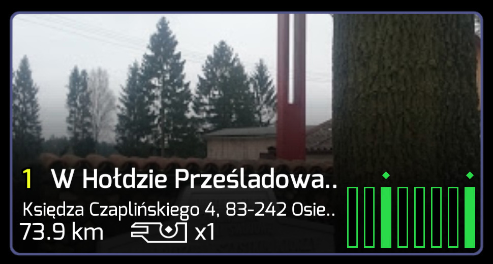
You look at a key in your inventory:
You're pretty sure this portal has two resonators in it...
You click on it and go into portal view:
Yep... it still looks like it has two resonators...
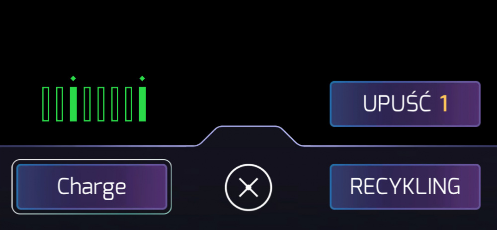
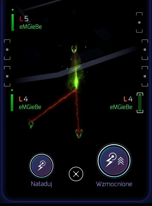
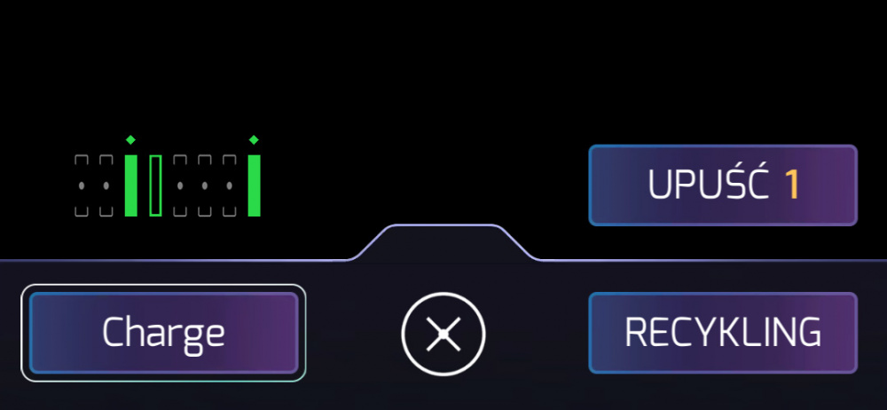
But then you go into charging view... and there's a surprise for you:
There are three resonators... just one of them has a very low XM energy level. But that one more resonator means the link/field is still on! So it's quite important info.
Now... Notice, that in this view (charging/deploy), you see resonators, and you see EMPTY SLOTS, that are gray and are like "placeholders" for resonators...
Why not use that feature in the key list view or in portal view?
This change is simple to implement, and can make it a lot easier to judge, how many resonators are there on a portal that we are looking right now.
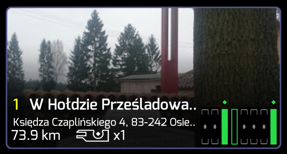
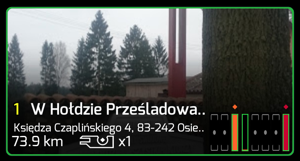
A simple example - the same portal in the proposed manner:
You can still clearly see that it's a Enlightened portal, but in a blink of an eye you know, that it has three resonators in it, two fully charged and one with very low XM level.
We could go a step further, by showing the color of the resonator (like IITC does), and just the color of the picture frame and resonator frames tell you which faction holds the portal... If it has yellow/orange resonators, you know it's low level... if it has a lot of blue/purple ones - you know it's high level... by just looking at the colors of the resonators...
but I understand, that this change might be too big to **** at once. ;) And I don't even think it looks good - it would be "too colorful". ;) I like the simple aesthetics of Prime... :)
So... let's make at least that one initial change - start showing placeholders / empty slots in key view and portal view, so players can easily judge how many resonators are there on a given portal. :)
Regards from Poland!
eMGieBe
PS: I don't know why the word "****" was changed it four stars... maybe that's censorship... but I meant the verb of "what you do to food when eating, after chewing it for some time". ;)
Comments
One bug I really miss from the old ingress, was that if you @'d someone in COMM, you would freeze up their app for a minute or so. Really handy guerrilla tactic!🤣
Thanks for that addition... though the post above isn't about "what I miss about Redacted", but what could be changed in Prime, to make it a little bit better! ;)
Cheers! ;)
+1 for the basic idea (green and gray).
-1000 for the colorful "evolution".
Yet another wonderful suggestion that will likely be ignored by Niantic
That's why I gave it just as an "option", so we can throw that away, and stick to the basics. ;)
When I made it, I already saw it was "too much"...
You think I should edit the post and throw it away, so it doesn't distract from the main (useful) point? ;)
Cheers! :)
eMGieBe
I would leave the additional idea in. Maybe give it a name so that it's easier to complain about it. 🤣
Yeah this was one the of many things that we screamed for in the beginning. Leave empty resonator slots grey.
That was when prime was released as optional beta; four years ago?
This sounds like an excellent quality of life improvement!